 Posted in
  Tags:
Tags: 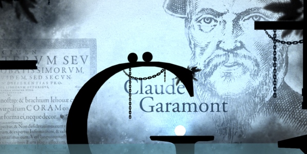
Developer: Ex Nihilo
Publisher: Plug In Digital
Platform: Mobile – Android, iOS PC – Steam
My life is filled with typing. As someone who enjoys writing, how could it not? My penmanship is lousy and with a high WPM it is always the preferred mode of writing. Between pieces drafted for myself for websites, there are thousands of things being typed out by my fingers on a daily basis. Why then, do I have such minimal understanding of the history of written language? I have my preferred fonts, but even then have never looked into why they’re named the way they are or the stories behind them.
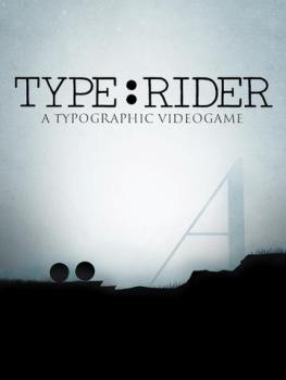
Type:Rider is a video game but it’s also a teaching tool. Through completing each themed stage, I was able to learn about the history of fonts from Clarendon to Helvetica. There are ten stages in all (with one secret level) and along the way you can read about what led to the development of certain fonts and what they were used for.
When it comes to playing, it is a standard platformer. Instead of being a little pixellated person though you’re two dots. They stick together mostly and you use them to jump, swim, and roll around stages. Because of the odd lead character, there are sometimes control issues. At times, the dots would end up “standing” on each other, which would mess up an otherwise easy jump. On other occasions, the dots flip around each other too much which causes other mistakes. It seemed most of the parts that made platforming a challenge were due to the unusual protagonist properties. Perhaps it would have been better to have a single dot.
It’s a shame that the relatively easy game is bogged down by some annoying platforming bits because everything else is absolutely stunning. Type:Rider starts out with relatively dull looking stages, but getting past the first two or three is definitely worth it. It seemed that the developer really had a strong concept for what to do with more modern fonts and executed it perfectly. Futura had a similarly retro-futuristic vibe while Didot was filled with nods from the art world at the time. Before completing any level, I ended up taking copious screenshots because of how fantastic the visual design was.
In all, it seems that Type:Rider is a game full of surprises. It might look like a very simple platformer which teaches a bit about fonts, but there is much more at play. Yes, it’s pretty easy, and yes, it is really about fonts. But the way that they express the “feel” of each font is spot on. They’re not used simply as platforms or as background art, but are treated with reverence. If nothing else, playing Type:Rider will give players a new and much-deserved appreciation of fonts.

3 1/2 out of 5 alpacas
Review code provided
About our rating system