‘Featured’

MISSING: An Interactive Thriller – Episode One Review

missingchapteronelogo

Developer: Zandel Media
Publisher: Zandel Media
Platform: PC – Steam

MISSING: An Interactive Thriller – Episode One is the first in (hopefully) a series of point and click “escape the room”-style games. As you can probably tell from the images, it also happens to be chock full of full motion video (FMV). I don’t know what exactly spurred this sudden FMV resurgence, but I’m definitely into it.

In any case, it starts you out right in the thick of things as you’re presented with a dude chained up in a room. Without getting much more context than that, we know what to do: Get those cuffs off! This is just the first of a dozen or so puzzles that you’ll need to solve in order to get out of this incredibly strange situation.

missingchapteronefeatured

Puzzles are incredibly simple for the most part, with at least one that left me frustrated. Mostly, that was due to my own overthinking of the darn thing, though. The story is a bit disturbing in what it implies, the acting is fairly good, and the scenes are shot well. The biggest issue is that it only took me about half an hour to complete it.

I’m hoping that the relative brevity of MISSING: An Interactive Thriller – Episode One will mean new episodes release frequently. However, it could be quite a while before we can check back in. In any case, the inaugural episode was a neat little game and I look forward to checking out later episodes as they release.


Score: 3

3 out of 5 alpacas


About our rating system

Life is Strange Episode 5 – Polarized Review

lifeisstrangeepisode5

Developer: DONTNOD Entertainment
Publisher: Square Enix
Platform: PC – Steam PSN – PS3, PS4 Xbox 360, Xbox One

Life is Strange is a series that I’ve been having a real on-and-off relationship with. It surprised me right out of the gate in a fantastic way. However, as the series went on, things felt drawn out. I can’t say I expected the conclusion the game provided right from the start. However, by Episode 4 it seemed pretty clear what DONTNOD Entertainment had been hinting at the entire time.

Episode 5 – Polarized is quite a ride, despite being the shortest of the episodes yet. Or, perhaps it is because of the brevity that they finally cut out all the fluff and provided a high-intensity episode from beginning to end. Now, it’s worth noting that I am not a huge time travel/sci-fi fan. In fact, I have never seen many of the iconic films or read the well-known books on these topics. Because of this I was tremendously impressed with how this game handled the results of Max’s time traveling. It was cool, creepy, and kept me on edge wondering what could possibly happen next.

lifeisstrangeepisode5

One of the weirdest aspects of the series for me is how absolutely dark things got by Episode 5. It’s not that the early game was particularly cutesy and fluffy, but it almost seemed like it would be a fairly typical (if sci-fi tinged) coming of age story. But then things started to get real — too real. Really disgusting stuff was happening to the students of Blackwell Academy. Even though Episode 5 doesn’t go to the lengths I quite though it would, ti’s still a huge tonal shift from the very beginning.

Was I happy with the conclusion? Sure, but (spoilers) I have heard that all that emphasis on choice in the game is actually for naught as far as the final ending is concerned. I could be wrong, but will discover soon enough for myself. I don’t like the idea that choice in this game is nothing more than a means by which to alter a few sentences that characters say to you throughout the episodes. That’s definitely how it felt, though, and hopefully there is at least a little more to it than that even if the conclusion plays out the same.

Would I recommend Life is Strange to others now that I have completed the series? I think so. Even though I was not in love with everything the game did, it provides an adventure game that is unlike most others on the market. Despite obvious inspirations from modern Telltale titles, it moves in its own directions and creates something unique. I’m very curious to see what DONTNOD does next, whether it be a second season (hopefully with a different cast) or something completely different.


Score: 4

4 out of 5 alpacas


About our rating system

POP: Pop Methodology One Review

popmethodologyexperimentonelogo

Developer: Rob Lach Games
Publisher: Rob Lach Games
Platform: PC – Steam

You know, I really had no idea what to expect when launching POP: Methodology Experiment One for the first time. The very first screen, which warned “THIS GAME MAY KILL YOU” revealed this was going to be quite the experience. I’m not sure whether that “experience” is one many will enjoy, though.

POP: Methodology Experiment One is comprised of a small handful of gameplay vignettes. Each explores a different game concept (racing, arcade shooting, walking, etc) and asks you to simply manipulate the screen for a few minutes. Once the time is up, you’re free to move onto the next section. It only takes about fifteen to twenty minutes to exhaust each section.

popmethodologyexperimentonefeatured

Visually, this game is a standout. The pixel art style is regularly distorted in dizzying ways. Seriously, I had a headache by the end. Despite the real physical pain POP: Methodology Experiment One caused me, I still appreciated the colorful, trippy aesthetic. The same is true of the music, except to a greater degree since I dug it a lot and was not left feeling ill by listening to it.

The issue is that there is so little to the game that even the low cost of $3.99 starts to look like a bit too much. There’s some sort of thematic touches going on throughout, but they failed to hit the mark. Finally, the video mixtape style utilized to string each game together felt completely out of sync with the rest of POP: Methodology Experiment One. It’s not a bad experiment, but as a game people will actually want to play through… well, not so much.


Score: 2

2 out of 5 alpacas


About our rating system

Armikrog Review

header

Developer: Pencil Test Studios
Publisher: Versus Evil
Platform: PC – Steam, GOG, Direct2Drive, Green Man Gaming, Nuuvem, Wii U

The Neverhood is a very important game to me. It was one of the first games that I ever played. It was a game that my dad and I played together and beat together. The Neverhood certainly has its fair share of problems and might not be the best game in the world, but it’s just such an interesting game that I can forgive those issues.

When Armikrog was announced, I was on cloud nine. A modern-day spiritual successor to one of my favorite childhood games? Sign me up. My dad and I eagerly pledged a good amount of dough to Armikrog‘s Kickstarter campaign and patiently waited for the day it would finally release. It was delayed quite a few times, but that was okay, because that would help make it a better game. Right?

ss_5adb5439ee6e757c13fd9f26b20f14e2b5a15aa7.1920x1080

Unfortunately, that isn’t the case at all. I dove straight into Armikrog expecting a similarly wonderful and strange experience as I had with The Neverhood. Instead, all I got was disappointment.

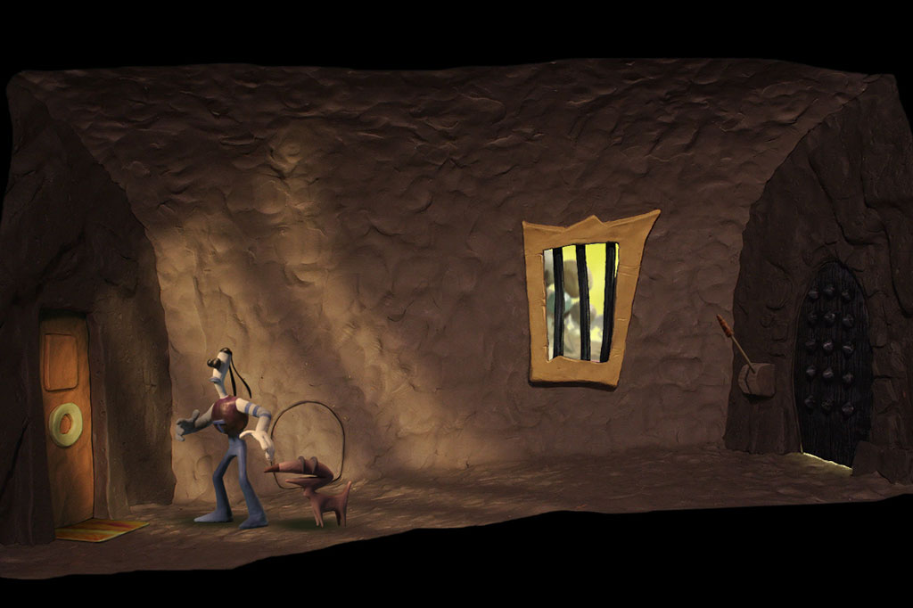
Immediately upon starting Armikrog, I was greeted with what is supposed to be a whacky, upbeat intro. Which it is, aside from the fact that the audio sounds like it was recorded in a closet with tin cans. I should have taken that as a sign of the awfulness that was to come, but I was blinded by excitement and continued on to play the game.

As I progressed through Armikrog, I began to notice more and more problems. Clicking on objects didn’t register half the time. The music liked to disappear every so often. Subtitles didn’t match what was being said and usually didn’t even pop up at the correct moment. Some puzzles were completely nonsensical and expected you to magically know things that weren’t previously made apparent. Not to mention there were bugs and glitches abound (there have been a few patches since I initially played and finished Armikrog; who knows how well they fix things, though).
ss_d557b5b154054b0a2e4ff72010faf364ea66c6de.1920x1080

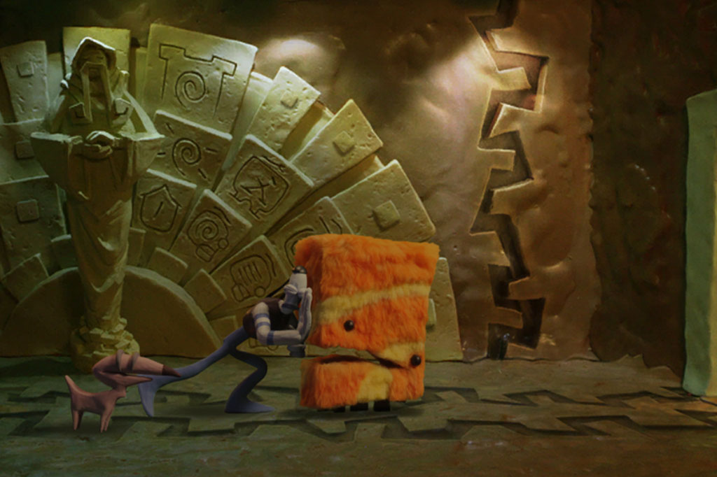
And those are just the gameplay and technical parts of Armikrog. While the graphics and music were fantastic (what music would actually play when it didn’t stop for no reason, anyway), the story, writing, and characters were barely there. I was hopeful considering the hilarious introduction with Tommynaut and Beak-Beak (our two heroes). However, what you see in the beginning is pretty much the most interaction you’ll see between the two throughout the entire game.

As for the story, there is actually a very interesting premise set up during an early part of Armikrog that you are able to read on a literal wall of text (if you played The Neverhood, it is reminiscent of the infamous Hall of Records). It’s probably the most enjoyable part of the game and got me pumped to see how it was going to play out. But, as you might have guessed, not too much happens after that and the ending is extremely anticlimactic and rushed. There’s also a villain, but he may as well not have even been included in Armikrog as he barely does anything.
ss_87d7ad5b4f8c60435caa37bf09067e9fea671a95.1920x1080

I could go on and on about my heart has been ripped into tiny pieces because of how very wrong Armikrog has turned out. I almost want to pretend that it doesn’t exist at all. Sure, you could say I set my expectations way too high or that patches have since fixed most of the problems (which doesn’t excuse the many delays before release or the lackluster story and characters). The fact of the matter is that Armikrog is incredibly disappointing and should be avoided if it all possible.


Pink Score: 1
1 out of 5 alpacas


About our rating system

Pokémon Shuffle Review

Pokémon-Shuffle-Mobile

Developer: Genius Sonority
Publisher: The Pokémon Company
Platform: 3DS, Mobile – Android, iOS

It’s funny how much I’ve begun to embrace the idea of mobile gaming (though I obviously still vastly prefer consoles and handhelds). I used to be extremely against mobile games for a variety of reasons, but I finally caved sometime in the last year or so and begun playing several different ones. Pokémon Shuffle is my most recent mobile game obsession, and for a good reason.

Basically, Pokémon Shuffle is a match 3 puzzle game. You must match the same Pokémon in order to deal damage to your opponent and beat the stage. Pokémon Shuffle keeps things interesting by allowing you to use a bevy of different Pokémon on your team. Furthermore, you must keep in consideration the attack power, types, and skills of your Pokémon in order to assure victory and high stage rankings. Some stages are pretty simple and easy, especially in the beginning. However, they eventually become more complex and require a bit of critical thinking due to opponents creating “disruptions” that can make things quite hectic. There are also “expert stages” that are timed, and as such, really test your puzzle skills and dexterity!

Screenshot_2015-09-22-18-38-01-1

Now, I tried to play the original version of Pokémon Shuffle on the 3DS, but I just wasn’t feeling it after trudging through the initial tutorial stages. I decided to give Pokémon Shuffle a second chance when it released for mobile devices, and boy did I instantly like it much more on my phone than 3DS. Maybe it’s because of the vertical one-screen layout, or it could be because it’s easier to use a mobile device’s touchscreen versus the 3DS’s. It’s also way more gorgeous and vibrant.

Unfortunately, the mobile version of Pokémon Shuffle retains some of the same annoyances that were present in the 3DS version. For one, the wait time between regaining hearts (or energy) is ludicrous at 30 minutes. Another issue includes absolutely ridiculous stages and capture rates that pretty much require you to spend your precious coins on power-ups and great balls. Alas, this is a freemium game, so such problems are expected and have to be tolerated.

Screenshot_2015-09-22-18-40-47-1

Even weeks after release, I’m still fervently playing Pokémon Shuffle. It’s just too addicting and fun, and has me hopeful for Nintendo’s future on mobile platforms.


Pink Score: 4
4 out of 5 alpacas


About our rating system

The Residents: Freak Show Review

The Residents: Freak Show Boxart

Developer: The Cryptic Corporation
Publisher: The Voyager Company
Platform: PC

The Residents are a band which have been around since the 70s crafting seriously unique music and mixed media experiences. As a fan, I’ve hungered for years to pick up the multimedia CDs they produced in the early 90s. The Residents: Freak Show is the very first of these experiments and came out alongside a music CD of the same name.

At first, I feared this would be a seriously lackluster product. The adventure title certainly seems that way at first. You simply click between a few screens which take place inside a, well, “freak show” and get a little CG representation of a performance. The graphics definitely look a bit lumpy and weird, but somehow that enhances the charm over 20 years later. Search a little deeper and you’ll uncover a whole other, and far longer, segment of gameplay beyond the easily accessible exhibits.

The Residents: Freak Show Featured

Hidden behind the Mole Man’s exhibit, as well as behind a “no admittance” sign you’ll find hours of extra content. For the Mole Man in particular, you actually get to hear (and watch) the story of how he became a member of the troupe. Unfortunately, it seems the other characters don’t get the same treatment. With that said, every main character has basically a music video which includes their entire song from the Freak Show album. It also feels like each character is given a believable edge which wasn’t present through the song lyrics alone.

Seeing one of my favorite The Residents albums in action was a stunning event. This CD-ROM absolutely exceeded my expectations with the huge amount of care given to each character’s video as well as the level of interactivity. It could have easily been a slideshow, but Easter eggs and additional story content make it an enjoyable exploration of an album. If you’re a fan of The Residents then at some point you need to play The Residents: Freak Show.


Score: 4

4 out of 5 alpacas


About our rating system

Life is Strange Episode 4 – Dark Room Review

lifeisstrangelogo4

Developer: DONTNOD Entertainment
Publisher: Square Enix
Platform: PC – Steam PSN – PS3, PS4 Xbox 360, Xbox One

Life is Strange Episode 3 – Chaos Theory left me feeling a little strange. It seemed that DONTNOD were on the precipice of something either really cool, or were set to completely lose me. Luckily, I enjoyed Episode 4 – Dark Room far more, though it wasn’t without some oddities. First off, it really feels like the ending of Episode 3 failed to play out in a significant way here.

Without spoiling anything, it was a very underwhelming resolution. Episode 3 made it seem like this event was a huge wrench in everyone’s plans, but then there’s very little issue to actually get back on the “main” storyline. Perhaps it’ll come back into play in Episode 5, but as of now it seems nothing more than an emotionally manipulative detour.

lifeisstrangeep4featured2

So, as for Episode 4 – Dark Room itself. Things are finally getting serious — far more serious than I ever expected when Life is Strange began. Although there’s a lot of melodrama, it’s easy enough to fall right into the tale. Once everything takes a turn for the creepy I was really involved and being led right down the path that DONTNOD wanted. That reveal right at the end? Yep, I seriously had no clue it was coming.

There were definitely low points to be had between the more climatic sections. For one, you’re forced to put all the clues together in one multi-part puzzle. At this point I simply wanted to get up and go, not sit around and finagle with what was ultimately a very easy set of puzzles. Playing with a controller made it more cumbersome than needed, but that’s my own stubborn fault for not switching to a mouse during the segment.

Life is Strange Episode 4 - Dark Room Featured

Finally, there’s the matter of how choices “pay off” in Life is Strange. Here’s an example with a spoiler. Victoria believed me when I spoke with her at the party. Why? Because I didn’t add insult to injury after dumping paint on her in Episode 1. The fact that she specifically referenced this act of pseudo kindness did not excite me. It just revealed the utter game-y nature of this video game. My choices should impact the story in ways that feel natural. This just seemed contrived.

I am still looking forward to Life is Strange Episode 5. For one, I’m ready to see how this story comes to a close. Not only that, but I’m anxious to see just how differently things do or don’t play out when two players have made completely different choices along the way.


Score: 3.5

3 1/2 out of 5 alpacas


About our rating system

Pongo Review

Pongo Logo

Developer: Drixy Games
Publisher: Black Shell Media
Platform: PC – Steam

There are practically zillions of platformers out in the world. However, very few have ever managed to scratch that same vertically-based itch that Jumping Flash brought into my life. I hoped Pongo might prove a solution that didn’t require pulling out a PlayStation console.

Well, Pongo is a bit similar in that you spend a lot of time jumping very high. This is due to the fact that you traipse around the stage with a pogo stick in first person. But that’s really where the charm ends, as gameplay itself is incredibly dull — and even becomes annoying due to iffy controls. There were a fair amount of times my jumps landed me on the very edge of a platform but unable to actually reach the flat surface. Instead, my only course of action was to fall off and try again.

Pongo Featured

When jumping betwixt platforms isn’t annoying, it’s actually a fairly simple experience. Enemies hang about stages but with a keen eye you can basically snipe most of them before they even get a chance to harm you. It’s only with bosses that you have to actually put your skills to the test. The goal? Jump across the stage until you reach the end gate and move onto one of the other 49 stages.

Then there’s the whole fact that (aside from your pogo stick) Pongo feels like a massive Lovely Planet ripoff. The graphics aren’t nearly as pleasant, though, looking more like something that I would draw before getting a glaring filter/effect placed over them. It’s definitely not attractive or stylish in my eyes. It seems a true “spiritual successor” to Jumping Flash 1 and 2 remains just a dream…


Score: 1

1 out of 5 alpacas


About our rating system

Spectra Review

spectralogo

Developer: Gateway Interactive
Publisher: Mastertronic
Platform: PC – Steam, Xbox One

Back in 2014, I came across a game by the name of Goscurry. It was a racing-style arcade game in which players navigated a single spaceship along a never-ending road suspended in space. It was incredibly challenging, but a ton of fun. This year, I discovered Spectra and couldn’t help but become intrigued because of the game’s similar nature.

In Spectra, you control a spaceship along a long, winding galactic highway. You collect blocks, dodge obstacles, and (hopefully) make it through to the end with a high score. The gameplay is simple enough as most of the time you’re only weaving left or right to stay safe on the road. Things get more challenging as you progress through each of the ten stages, but not as much as you might expect.

spectrafeatured

This is the main contrast between Goscurry and Spectra: Difficulty. You failed in Goscurry by making one wrong move. Here, you’re given a lot more freedom. Crash into a barrier? You’ll still likely be fine as long as you don’t panic. I even came across a glitch where the ship would warp back up from underneath the road to inadvertently save your run. Despite being an easier game overall, it still offers a lot of challenge and two difficulty settings to keep players on their toes.

Chances are I would have enjoyed Spectra much more if I had not previously played Goscurry. The graphics are nice and vector-like, but less artful than I would have hoped. Similarly, the music by Chipzel is good, but apparently chiptunes of this sort are not to my personal taste. I’m the odd man out! Of course, Spectra still provides a nice way to pass the time with quick play sessions and arcade sensibilities.


Score: 3

3 out of 5 alpacas


Review code provided
About our rating system

Is the Vita Dead? Not As Far as I Can Tell!

So, by this point we’ve all probably heard the comment that the PlayStation Vita is a “legacy system.” Of course, there was also the update that this was just a misunderstanding and only meant to refer to the original version of the system. With that said, the reason this statement made news was because Vita fans do feel this is Sony’s true opinion on the console. It launched in 2012 (in the U.S.) and rarely sees much attention in press conferences.

Even if Sony has mostly abandoned the device with first party support, third parties are absolutely dominating the handheld. Just as they did with the PSP before, niche companies are bringing their wares to the system and finding a devoted audience. Here is a list of some of the games coming soon which make me excited to be a Vita owner.

Read more »