Posts Tagged ‘2010s’

Freedom Fall Review

BoxArt

Developer: Stirfire Studios
Publisher: Stirfire Studios
Platform: Android, iOS, Ouya, PC (Reviewed)

Freedom Fall is one heck of a game. It might not be long or incredibly complex but it offers up some entertaining platforming play alongside really neat writing. But I’m getting ahead of myself. Let’s discuss the basics of the game before showering it with positive platitudes.

In this game you play as a shoe-less boy with hair that looks like fire and is apparently named Marsh. Young Marsh is trapped in a tower filled with traps. His goal is to fall from the top of the tower to the bottom but it’s far from easy. If you’ve never played a vertical platformer before then this might take a little getting used to. After all, it can be hard to judge your fall if you can’t even see what’s below you. Usually it isn’t so bad as to cause many repeat jumps, at least.

Why is Marsh in this tower seeking his freedom? By reading the scrawls painted on the wall, you quickly become introduced to a princess character. She is the one who has placed diabolical spikes and saws all about the tower as a means to stop you. Try and avoid them but you’ll definitely hit many on your way down.

Freedom Fall Screenshot

The princess serves as by far the most interesting character (of the two) because she pushes the narrative forward. She describes how and why she must punish Marsh, as well as how she abhors the typical princess narrative. This includes wearing dresses, being saved, and apparently talking to birds. It’s incredibly refreshing to see a character like this although we primarily see her through her personal graffiti.

Controls are a bit finicky, though. I played with a 360 controller on PC and found them to be not as precise as they could be. Primarily my issues were with hanging/climbing on parts of the wall. Of course, the 360 gamepad is known for being rather imperfect for specific control so who knows who really is at fault here.

In any case, Freedom Fall is a very brief but fun experience. It only took me an hour to play through once, although there is definitely reason to replay if you want to collect all the gears and reach a higher score. I just wish we could have seen even more of the princess and her story.


Score: 3

3 out of 5 alpacas


About our rating system

Omegalodon Review

Omegalodon Boxart

Developer: North of Earth
Publisher: North of Earth
Platform: PC (Desura, DirectSteam)

There are a few things I’ve always really wanted to do in games. One is to get to be a serial killer in a cheesy horror movie-type title and another is to be a rampaging dinosaur. As you might guess from the title, Omegalodon fits into the category of “rampaging dinosaur” (or at least some sort of giant fish-reptile hybrid). The question is if it can stand up as a worthy experience.

When first playing Omegalodon, I was incredibly confused as to what to do. Judging by the Steam forums, this seems a somewhat common response from new players. If you take the time to read any user-created guide though you’ll see things are pretty simple. You can play on the side the giant monster or with the police and army who are trying to stop it from destroying the city. If you join monster team then you can either inhabit the actual omegalodon (only one per game) or be an enviro. Enviros are trying to preserve this rare species and have healing powers.

Omegalodon Featured

Of course, the army and police units exist to stop it at all costs. They can hop around in a variety of weaponized vehicles and attempt to stop further destruction. Unfortunately, they can also engage in shooting each other which is what some games devolve into if nobody play as the monster. You can always tell who is on what team by opening up the map and checking the color of their location marker.

So the game is actually quite simple. But even so, there are not many people playing right now. This is the same issue that befalls a lot of indie multiplayer releases. I have encountered two kinds of regulars so far. One group was incredibly rude to newbies and the other appeared to be a group of children who were having fun roleplaying rather than sticking to the army/soldiers vs. monster gameplay.

When no one wants to play the game “properly” it’s hard to get a feel for how it is actually supposed to play out. When inhabiting the omegalodon, his health decreases fairly fast too which makes it hard to do too much before dying. Overall, it does seem like a game that needs a bit more structure more to feel like a fleshed out title. That, or simply needs more players who can make a match exciting. I’d like to have a good match myself, but after hours of trying, have yet to really hit it off with Omegalodon. If you’re committed to playing, make sure to rope in a few friends as well.


Score: 1.5

1 1/2 out of 5 alpacas


Review code provided
About our rating system

Lone Survivor: The Director’s Cut Review

Lone Survivor Boxart

Developer: Superflat Games
Publisher: Curve Studios
Platform: PS3 (Reviewed), Vita

When Lone Survivor originally came out last year on PC I was simply enamored with it. Everything seemed pitch perfect and developer Jasper Byrne, who makes no secret of his affection for Silent Hill, seemed to manage something of equal quality. At least, that’s how I felt at the time. Incredibly, a year can do a lot – such as exposing me to even more modern indie horror experiences. Now that I’ve returned to an updated version does it still hold that same intense appeal? Somehow, it seems my stance has changed. No longer am I simply overwhelmed by the subtle story, visuals, and music. I have become more critical on my second time through.

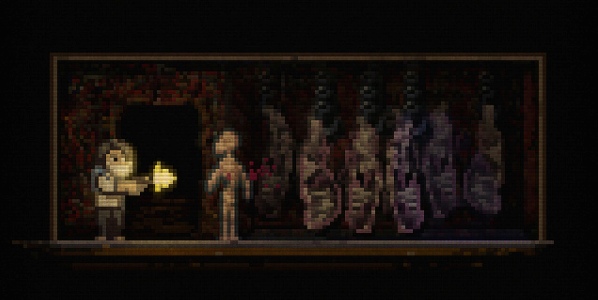
For those fresh to Lone Survivor, the game focuses around a man who believes himself to be the “lone survivor” of an epidemic. Now, the world is plunged into darkness with creepy monsters wandering around. As it turns out, he is not the only human left but those he meet all seem to have issues of their own – if they’re even real. As you explore, hints of the story are peppered throughout, leading the player to question what is real and what is simply a projection of the protagonist’s mind.
Lone Survivor: The Director's Cut Screenshot 1

Gameplay plunges right into survival horror’s past to provide an experience that forces you to be very careful with your character’s health. It takes only a few scratches or bites to kill him. As such, you definitely want to avoid enemies whenever possible. This is doable by purposefully placed hiding spots. When utilized properly, you can sneak right by creatures safely. In the beginning, these moments are tense. However, during the second main area of the game there are very few hiding spots to be found. This is not the end game, either! It causes you to have to fight but unfortunately you have to fight a lot.

Of course, just like retro horror games, you aren’t meant to be shooting all the time. Because of this, there are only limited bullets, flares, and the like to aid you in battles (for about half the game). The scarce resources are an issue because of the strange difficulty increase within this large area! Players must shoot with incredible care so as not to waste bullets. It’s true that you can use pills to regain items but these may change the ending received. If I were designing the game, I would reduce enemy encounters tremendously because having them so frequently causes more frustration than fear.

Along these lines of restricted ammo there are also a fairly small amount of food items (again, until a certain point later on). Food is necessary because the survivor needs sustenance regularly. He’ll even stop the game to share the state of his hungry stomach with the player. The intent is cool, but it also becomes a bit annoying if you get into fights too often. Damage can be healed by food, but even if you’re not damaged, you’ll still become hungry. Eating better food allows a longer time between eating but still not as much as might be expected.
Lone Survivor: The Director's Cut Featured

Finally, the coup de grace of classic horror is the requirement of saving in a specific way. You must venture back home and sleep in bed to save. Thankfully, saving is unlimited. How can you always get back? There are mirrors which act as warp points throughout the world. It’s a smart design for an overall archaic mechanic. It seems the point of deliberate saving at the bed serves the story, but it would make things a little less frustrating to be able to save at any time. Yes, it’s scary to know you’ve not saved in a while but that becomes annoying when you end up getting killed long after a save.

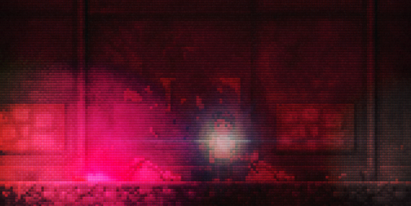
Even with all these qualms, the rest of Lone Survivor manages to shine. The pixel art looks fantastically crisp on a large TV set as well as on Vita’s OLED screen. Atmosphere was very carefully rendered to keep the game looking creepy, even if gameplay sometimes hinders it. The music itself is as fantastic as ever with a multitude of tracks that seem to hearken back to Akira Yamaoka’s Silent Hill soundtracks. Of course, there are even references back to Silent Hill 2, which certainly made me smile.

Lone Survivor: The Director's Cut Screenshot 2

What exactly about Lone Survivor: The Director’s Cut is so different from before? For Vita, there are added touch features and PS3 has rumble support. Neither are necessary, but hey. The meatier changes focus on new tracks, areas, side quests, and two new endings. Most of this content is locked behind New Game + though, making it so that everyone will first experience Lone Survivor as it was originally intended. All this added content came at Sony’s request and will eventually make its way back to PC as well.

So when it comes right down to it, Lone Survivor: The Director’s Cut is certainly the definitive edition of the game. However, it has a handful of issues that keep it from being a purely scary experience. Frustration induced by too many enemies, the survivor’s empty stomach, and losing a fair bit of progress to saves, are the main ones. There is also one extended chase scene which is seriously rage inducing to play on Vita as the pause button is in an awkward location (have never liked the Start/Select buttons on the handheld). Still, those who have not played it may still want to give the game a chance. Just be sure to heed my warning: Conserve your resources, save at every possible juncture, and still be prepared for a tough run!


Score: 3

3 out of 5 alpacas


Review code provided
About our rating system

Doorways: Chapter 1 & 2 Review

Doorways Boxart

Developer: Saibot Studios
Publisher: Saibot Studios
Platform: PC (Desura, Steam)

In the past year or so, it seems that many indie developers have been doing nothing more than riding off the successful formula of Slender. Although the Slender Man mythos itself follows a whole host of “serial stalker” tropes to begin with, many developers have latched onto the design as if it were the only way to make a horror title. Of course, it’s not, and we have a whole history of games within the genre to prove it. I say all this because Doorways does not follow that safe (and frankly, tiring) path and instead charts its own course toward creepiness.

Read more »

Telepath RPG: Servants of God Review

Telepath RPG: Servants of God Boxart

Developer: Sinister Design
Publisher: Sinister Design
Platform: PC (Desura, Direct, GamersGate)

This post is part of the Indie RPG Bundle review collection

It’s possible that if you’re reading this review that “Telepath RPG” might sound familiar to you. Having never heard of Telepath RPG: Servants of God before, it was quite the surprise that there were actually two previous games in the series. Both appeared as free titles on Newgrounds. Those Flash titles appear to have set the basics for what the series would become in its third iteration.

Telepath RPG: Servants of God sets the stage in a fantasy Middle East where people have come to impose their religion upon the local people of Ravinale. You and your parents are sternly opposed to these new rulers and vocal enough that your entire family is imprisoned! But there are many others looking to kick these theocrats out of the city. With these soldiers at your side, the player must serve as a tactician to lead them to victory. Unfortunately, the story is static in that you can’t change the main character’s gender or race despite it not affecting much (beyond the obvious usage of “he” in voiced lines).

The game is played from a top down perspective where you control each of the teammates. Actions are always governed by the player and include positioning, attacks, and healing. Each character has a max number of places they can move per turn and distances for their attacks. With each in your hands, it’s required to keep track of positioning so that one character doesn’t block another out of attacking or anything like that. Play is pretty simple and that’s a big part of what makes it so fun. It’s incredibly enjoyable to control the team and keep them smartly placed for the most effective victories.

Telepath RPG: Servants of God

Beyond these main story battles there are also side quests to be completed. Regardless of what you’re doing, Servants of God is infused with tons of chatter. Characters all have personalities apparent through their words and the writing is a pretty good read. Many, but not all, characters also receive voice acting to speak their lines. It seems the voice actors might not be professionals, but they are (usually) not embarrassing to listen to.

One point that might bother some players are the visuals. The gameplay screens for battle and exploration depict characters as very cartoony. It definitely clashes with the otherwise high quality portraits. Some scenes have colored drawn backdrops that both look unpolished and like they were pulled from a fable. I’m not sure how that works out, I appreciated them nonetheless.

RPG players who are willing to spend some time with Telepath RPG: Servants of God just might find it to be surprisingly enjoyable. It’s not perfect, but offers easy to understand gameplay and a variety of difficulty levels so most everyone can play.


Score: 3.5

3 1/2 out of 5 alpacas


About our rating system

Cognition: An Erica Reed Thriller – Season One Review

Cognition: An Erica Reed Thriller Boxart

Developer: Phoenix Online Studios
Publisher: Phoenix Online Studios
Platform: Mobile – iOS, PC – GOG*, Steam, etc

Cognition: An Erica Reed Thriller is an episodic point and click adventure series which just concluded its first season. It took Phoenix Online Studios about a year to pump out all four episodes, but now that it has concluded we can finally assess how the full product stands against adventure gaming competition.

Read more »

Ironclad Tactics Review

Ironclad Tactics Boxart

Developer: Zachtronics
Publisher: Zachtronics
Platform: PC

What happens when you mix the tension of the American Civil War with robots? Well, you get something like Ironclad Tactics. As strange as it may seem, developer Zachtronics have managed to pull off the unusual premise with their own brand of complex gameplay. Played as a tactical, turn-based card game it’s quite the unique title. Being unique isn’t necessarily a qualifier for a good game though, so let’s examine it in more detail.

Ironclad Tactics is played via decks of cards and a battlefield grid with opposing forces on each end. The player utilizes robots known as Ironclads, but also is able to use human troops and stat modifiers as well. All of these tools are summoned via the cards, which are pulled from the selected deck. At the start, there’s not much deck-building to do – you must successfully complete battles to unlock more.

Ironclad Tactics Screenshot

As turns progress, action points are accumulated. AP points are necessary to use any cards as each has its own AP score. Weakling Ironclads cost a measly 1AP while other, more powerful tools are far pricier. Keeping an eye on AP is important as it replenishes slowly. As each turn progresses, you gain AP back, but that also gives the enemy another turn to advance forward. As the decks draw cards randomly, moments of watching the AP meter refill can be intensified further by waiting for the “right” card to be drawn.

If you’re now interested in giving Ironclad Tactics a go then be prepared for some tough fights. This is one hard game. No, it isn’t as outwardly complex as Zachtronics’ previous SpaceChem, but it’s still tough. Without the right deck you just won’t survive. Similarly, puzzle matches (which require you to use a specific deck) can be difficult too as the decks are unfamiliar. Managing your troops against an onslaught of enemies is fun but expect to deal with a lot of retried stages unless you’re a maestro of all card-based games.

With that said, there is a lot of charm infused into the game, making it more than just a basic digital card game. All cards are rendered on the playing field in a cartoony fashion. Between battles, the story is told via comic panels. The art is gorgeously colored although the art style manages to create awkward faces for some characters. Regardless, it helps showcase the effort put into this product which is better than average.

Ironclad Tactics Featured

Unfortunately, likely because of low publicity, there are not many players online if you want to hit up an online skirmish match. The Steam Community forums reveal there are some, but you basically have to befriend them in order to give the mode a try. That, or make sure your friend grabs a copy as well. This isn’t the fault of the game though so much as it is a typical issue with any online component of indie games.

Ironclad Tactics is definitely not for everyone. First, you have to be interested in thinking strategically while playing. Secondly, you have to be able to grasp some basic card game concepts. The main thing though is being persistent and also willing to experiment with new decks. If you’re willing to do all that while playing a single game then go forth!


Score: 3

3 out of 5 alpacas


Review code provided
About our rating system

Gamebook Adventures 6 – The Wizard from Tarnath Tor Review

Gamebook Adventures 6 - The Wizard from Tarnath Tor

Developer: Tin Man Games
Publisher: Tin Man Games
Platform: Android, iOS, PC (Desura)

This post is part of the Indie RPG Bundle review collection

Many of us have “played” gamebooks in the past whether or not we called them by that name. Perhaps you played Choose Your Own Adventure stories or the Lone Wolf series. Whatever the case, Tin Man Games have been focusing on creating gamebooks for the digital audience and they do quite well at it. The Wizard from Tarnath Tor is the sixth in their Gamebook Adventures line.

The story focuses on your lead character, who begins the story stuck in a trap. You are saved by a wizard who then regales you with a tale about how he came to be there. According to him, he was a wizard from the great City of Tarnath. At least it was until it was destroyed in a rampage. This man asks for you to return to the city and fetch his wizarding tools because he senses that something evil has begun to take place there. And, of course, whether that is believed or not – that’s the journey you must undertake!

The Gamebook Adventure series pays great attention to keeping their games very book-like. Pages look realistic and page flips are animated as well. In a really useful move, you can also increase or decease the font size which is something that can’t be done with a traditional book. The Wizard from Tarnath Tor has a great deal of pages and choices to make along the journey.

As you might expect, it’s the choices that make these games the most interesting. After reading pages of text you are regularly presented with a new choice to make. Choices may reveal hidden objects, new dangers, or simply flesh out the adventure. Battles occur in turn-based fashion with dice rolls deciding the offense and defense of each side.

However, it seems something must have been amiss during its production because the writing does not stand up as well against The Siege of the Necromancer (the only other game in the series I’ve played thus far). No, it’s not necessarily the skill level because I was still curious to unravel the story. Instead, my eyes were regularly drawn to grammatical flubs. That, and the phenomenon of re-using the same word many times in a short span was also common. Even with these troubles, I still found the experience enjoyable.


Score: 3.5

3 1/2 out of 5 alpacas


About our rating system

Iron Soul Review

Iron Soul Boxart

Developer: BluBee Games
Publisher: BluBee Games
Platform: PC
Review code provided

The ideas behind Iron Soul are great. The game is a mix of 3rd person shooter and platformer in a sci-fi future filled with robots. Developer BluBee Games even name-dropped MDK as one source of inspiration for their title. With that being the case, they have some big shoes to fill. But it doesn’t seem to reach that lofty goal, or perhaps MDK is just not that fun in the modern era.

Players interact with the game through a robot by the name of H-25. H-25 is equipped with a laser gun (to start) and able to jump pitiful distances before obtaining double jump. With that said, the bot does look pretty snazzy in its cab-colored paint job. In the beginning, players are simply tasked with following orders from omnipotent voices – presumably, one is your creator.

Iron Soul Featured

One thing that Iron Soul gets right is the visuals. It’s rare to see independent developers create fully 3D environments but that’s exactly what they’ve done. Once you get out of the lab, things start to look quite pretty as well. Robot designs are a little silly though as your main enemies are orb-shaped bots that either walk on the ground or zip about in the air.

So what brings this game down from being great? Despite the serious work on visuals, the world itself is hard to traverse during platforming segments. Super Mario 64 was not the first game to attempt 3D platforming, but it was the first time it was done well. Iron Soul falls into many of the pitfalls of a bad platformer. It is hard to tell where H-25 will land! Thankfully, most platforming segments are brief, but they can be incredibly painful.

Firefights suffer as well, unfortunately. Perhaps in regards to keeping this game “authentic” to older PC titles, there is no automatic cover system in place. You can cover, but it requires pressing CTRL twice by a wall. This adheres you to it, allowing you to pop up for shots. With this half implementation of a feature it adds more annoyance to fights than there needs to be. After all, you just want to run into cover, not focus on making sure you’ve set it up right.

Iron Soul Screenshot


Shootouts are also usually not massive but they can be incredibly annoying as well. For example, an early boss fight features an enemy with an instant kill laser attack. It’s easy to dodge if you can see it coming. However, little enemies will scatter behind you, making you need to face them to shoot. Doing so turns your back to the big enemy though leaving you entirely prone to unexpected laser deaths. Overall, fights are more frustrating than fun, but at least health is plentiful.

This is such a shame because Iron Soul looks great. It just feels bogged down with the worst aspects of older games. There’s nothing wrong with chasing a hard, authentic experience (see another game with the name “Souls” in it) except when it will primarily alienate the players. With that said, Iron Soul may find an audience thanks to fairly good (and unintentionally campy?) writing that is marred by oddball voice actors. There’s something to the game that is intriguing, but you have to get through all the frustrating bits to see it.


Score: 1.5

1 1/2 out of 5 alpacas


About our rating system

Unemployment Quest Review

Unemployment Quest Boxart

Developer: Charles DeYoe
Publisher: Charles DeYoe
Platform: PC (Desura, Direct)

This post is part of the Indie RPG Bundle review collection

Chances are there’s probably been a time in your life when you’ve found yourself struggling for work. For me, the struggle is current and not something that should be desired by anyone. At the very least I’m lucky enough to have a place to call home until luck finally strikes. So maybe it’s because of my current state but I found Unemployment Quest to be quite a neat and unique title.

You start the game as a young guy who has apparently survived college but can’t find work anywhere around town or even at the mall. Some of his friends have found work and it seems only the main character is left out. Day after day, he must return home to his parent’s house to confront a supportive but disappointed mother and outright annoyed father.

Unemployment Quest Featured

So how does this factor into a video game form? You see, the player must battle those he wishes to give a resume to, and battle for increasing confidence (and gaining money). The fights are much like a typical JRPG and the art style meshes with this. It looks much like a 16-Bit game even if it has some different thematic elements at play. Leveling up helps a lot with fights but still doesn’t seem to change the mood of prospective employers.

In a way, I appreciate the commitment to making job acquisition an impossibility for most of the game. However, because of that, it seems silly that money is so easy to come by in the game. For a while you’ll be stuck broke, but soon enough there are treasure chests that start popping up with gratuitous amounts of money. Real life doesn’t work that way although I sure wish it did! Of course, the money is needed for buying new items a la every other RPG out there.

Once you get past the few iffy points like that, Unemployment Quest is definitely worth checking out. It’s cool to see the various ways the typical JRPG world was tweaked to service a story about the incredibly relatable task of looking for a job.


Score: 4

4 out of 5 alpacas


About our rating system